Primary Sources A Natural History of the Artist's Palette
For
all its transcendental appeals, art has always been inextricably
grounded in the material realities of its production, an entwinement
most evident in the intriguing history of artists' colours. Honing in on
painting's primary trio of red, yellow, and blue, Philip Ball explores
the science and stories behind the pigments, from the red ochre of
Lascaux to Yves Klein's blue.
Published
July 23, 2020
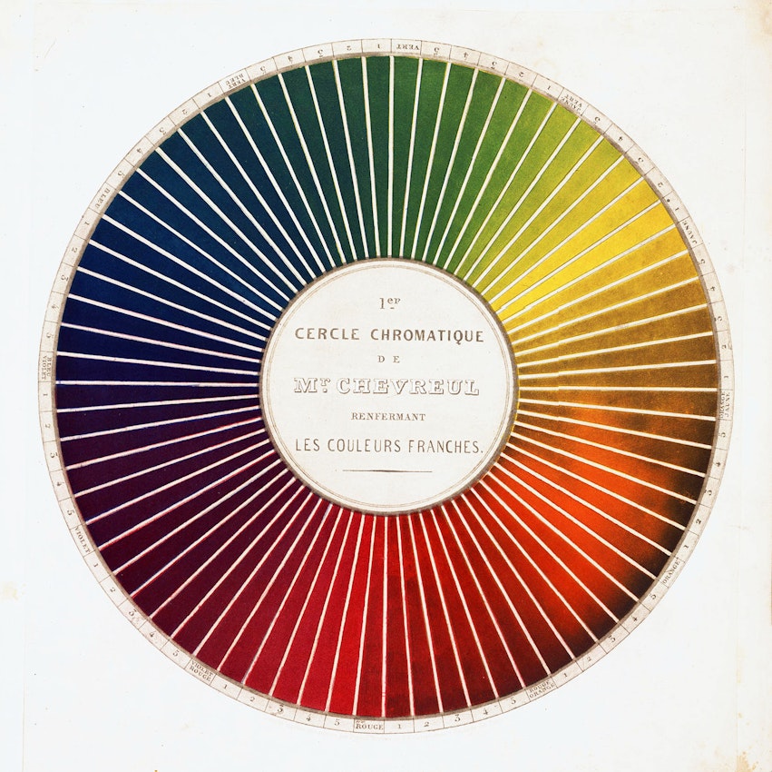
Plate 3 from Michel E. Chevreul's Exposé d’un moyen de définir et de nommer les couleurs (1861) — Source
Having
taken many centuries to figure out what the primary colours are, we are
now in the process of abandoning them. The very notion of primaries can
now spark furious arguments among colour specialists. Some point out
that the trio many of us learnt at school — red, yellow and blue —
applies only to mixing pigments; mix light, as in the pixels of
television screens, and you need different primaries (roughly, red,
blue, green). But if you print with inks, you use another “primary”
system: yellow, cyan and magenta. And in the rainbow spectrum of visible
light, there’s no hierarchy at all: no reason to promote yellow light
above the slightly longer-wavelength orange.
What’s
more, even though painters learn how to mix colours — blue and yellow
to give a green, say — they quickly learn that the results can be
disappointingly muddy compared to a “pure” pigment with the intended
colour: it’s especially hard to get a rich purple from red and blue. As a
result, artists often think of colour not so much as an abstract
property but in terms of the substance that makes it: madder red,
ultramarine blue, cadmium yellow. To truly understand what colour means
to the artist, we need to think of its materiality. Or to put it another
way, what the artist’s palette is capable of producing has always
depended on the materials at his or her disposal, and the ingenuity that
went into procuring them.
That
ingenuity has never been lacking. During the last Ice Age life was
nasty, brutish and short, yet humans still found time for art. Tools
dated to around one hundred thousand years ago have been found in
Blombos Cave on the coast of South Africa: grindstones and hammer-stones
for crushing a natural red ochre pigment, and abalone shells for mixing
the powder with animal fat and urine to make a paint that would be used
to decorate bodies, animal skins, and perhaps cave walls. The paintings
made 15-35 millennia ago at Chauvet, Lascaux and Altamira attest to the
genuine artistry that early humans achieved using the colours readily
to hand: black charcoal, white chalk and ground bone, and the earthy
reds and yellows of ochre, a mineral form of iron oxide.1
But
the classic red pigments don’t rely on iron minerals, the hue of which
is not the glorious red of a sunset or of blood, but of the earth. For
many centuries, the primary red of the palette came from compounds of
two other metals: lead and mercury. The pigment known as “red lead” was
made by first corroding lead with vinegar fumes, turning the surface
white, and then heating that material in air. It was used in ancient
China and Egypt, Greece and Rome.
For the Roman author Pliny, any bright red was called minium
— but by the Middle Ages that Latin term was more or less synonymous
with red lead, which was used extensively in manuscript illumination.
From the verb miniare (to paint in minium) we get the term “miniature”: nothing to do, then, with the Latin minimus,
“smallest”. The association today with a diminutive scale comes simply
from the constraints of fitting a miniature on the manuscript page.
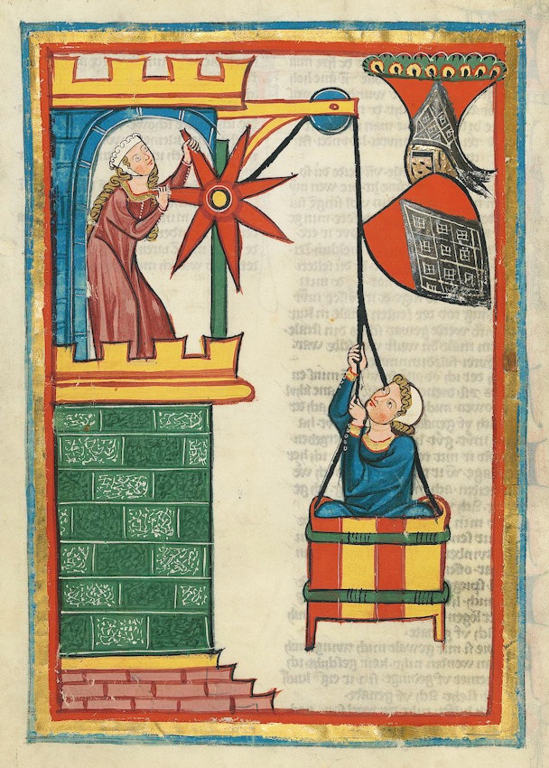
Illustration
for the poet Herr Kristan von Hamle (folio 71v), from the Codex
Manesse, an early 14th-century poetry anthology produced in Zurich — Source
Pliny’s best minium
was a different red pigment, called cinnabar. This was a natural
mineral: chemically, mercury sulfide. It was mined in the ancient world,
partly for use as a red colourant but also because the liquid metal
mercury could easily be extracted from it by heating. Mercury was
thought to have almost miraculous properties: ancient Chinese alchemists
in particular used it in medicines.
By
the Middle Ages, alchemists and craftspeople knew how to make mercury
sulfide artificially by combining liquid mercury and yellow, pungent
sulfur (available in mineral form) in a sealed vessel and heating them.
This process, which was described in the craftsman’s manual De diversis artibus
(ca. 1122) by the German monk Theophilus, can give a finer-quality
pigment than natural cinnabar. It was a procedure of great interest to
alchemists too, as the Arabic scholars of the eighth and ninth centuries
had claimed that mercury and sulfur were the basic ingredients of all
metals — so that combining them might be a route to making gold.
Theophilus had no such esoteric goal in mind; he just wanted a good red
paint.
This “artificial cinnabar” became known by the name vermilion.
The etymology is curious, and shows the confusing and treacherous flux
of colour terms in an age when the hue of a substance seemed more
significant than vague, pre-scientific notions of what its chemical
identity was. It stems from the Latin vermiculum (“little
worm”), since a bright red was once extracted from a species of crushed
insect: not a paint pigment but a translucent dye of scarlet colour,
arising from an organic (carbon-based) substance that the insects
produce.
Such dyes were also known as kermes (from the Sanskrit kirmidja:
“derived from a worm”), the etymological root of crimson. Because the
insects that made it could be found on Mediterranean trees as clusters
encrusted in a resin and resembling berries, the dyes might also be
called granum, meaning grain. From this comes the term
ingrained, implying a cloth dyed in grain: the dye was tenacious and did
not wash out easily. “‘Tis in grain sir, ‘twill endure wind or
weather”, Olivia assures Viola of a painting in Twelfth Night.2
Red
dyes were associated with majesty, opulence, status and importance:
they were the colours used for cardinals’ robes. Painters needed fine
reds to render on board and canvas these dignitaries whose portraits
they were increasingly commissioned to paint: Raphael’s Pope Julius II (1511-12) derives its aura of power partly from the brilliance of its reds.
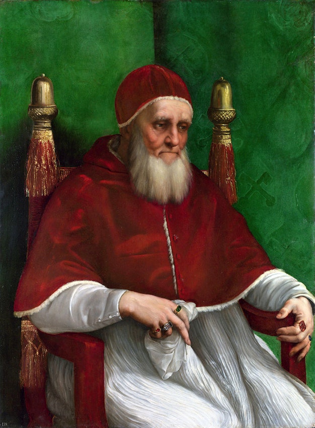
Raphael, Portrait of Pope Julius II, 1511 — Source
Red
lead and vermilion served well enough in the Middle Ages, but the
increased demand for verisimilitude in the Renaissance meant that the
orangeish hue of red lead or vermilion wasn’t adequate for depicting the
purplish magnificence of these dyes on canvas. One alternative was to
turn the dyes themselves into a paint pigment, by fixing their colourant
molecules onto solid, colourless particles that could be dried and
mixed with oils. This process involved some challenging chemistry, but
even the ancient Egyptians knew how to do it. The basic idea is to
precipitate a fine-grained white solid within a solution of the dye: the
dye sticks to the particles, which dry to make a dark red powder. In
the Middle Ages this process used the mineral alum, which can be
converted to insoluble white aluminium hydroxide. The pigment made this
way was called a lake, after the word (lac or lack) for a red resin exuded by insects indigenous to India and southeast Asia.
One
of the best red lakes of the late Middle Ages and the Renaissance was
made from the dye extracted from the root of the madder plant. As lake
manufacture was perfected, artists such as Titian and Tintoretto began
to use these pigments mixed with oils, giving a slightly translucent
paint that they would apply in many layers for a deep wine-red tint or
wash over a blue to make purple.
Aside
from the creation of red lakes, rather little about the painter’s reds
changed from the Middle Ages until modern times. The Impressionists in
the late nineteenth century made avid use of the new yellows, oranges,
greens, purples, and blues that advances in chemistry had given them,
yet their reds were not really any different to those of Raphael and
Titian.
It
wasn’t until the early twentieth century that a vibrant and reliable
new red entered the repertoire. The discovery of the metal cadmium in
1817 immediately produced new yellow and orange pigments, but a deep red
was made from this element only around the 1890s. The yellow and orange
are both cadmium sulfide; but to get a red, some of the sulfur in this
compound is replaced by the related element selenium. It wasn’t until
1910 that cadmium red became widely available as a commercial colour,
and its production became more economical when the chemicals company
Bayer modified the method in 1919.
Cadmium
red is a rich, warm colour — and arguably the painter’s favourite red,
except for the price. That was certainly true for Henri Matisse, for who
red held a special valence — as his interiors in La Desserte (aka The Red Room, 1908), Red Studio (1911) and Large Red Interior
(1948) attest. Of the second of these, the art critic John Russell said
“It is a crucial moment in the history of painting: colour is on top,
and making the most of it.”3
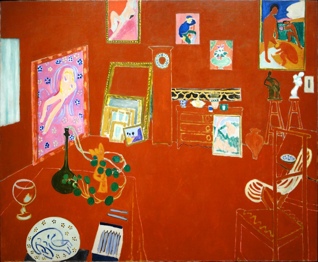
Henri Matisse, The Red Studio, 1911 — Source
Brighter
yellows were, from antiquity, made from synthetic compounds of tin,
antimony, and lead. The ancient Egyptians knew how to combine lead with
antimony ore, and in fact a natural mineral form of that yellow compound
(lead antimonate) was also used as an artists’ material. It could be
found on the volcanic slopes of Mount Vesuvius, which is how it came to
be associated with Naples: from the seventeenth century a yellow
composed of tin, lead, and antimony was often called “Naples yellow”.
Other recipes for a yellow of similar appearance specified mixing the
oxides of lead and tin. The ingredients weren’t always too clear,
actually: when Italian medieval painters refer to giallorino,
you can’t be sure if they mean a lead-tin or lead-antimony material, and
it is unlikely that the painters recognised much distinction. Before
modern chemistry clarified matters from the late eighteenth century,
names for pigments might refer to hue regardless of composition or
origin, or vice versa. It could all be very confusing, and from a name
alone you couldn’t always be sure quite what you were getting — or, for
the historian today, quite what a painter of long ago was using or
referring to.
In
some respects that’s still true now. A tube of modern “Naples yellow”
won’t contain lead (shunned for its toxicity) or antimony, but might be a
mixture of titanium white and a chromium-based yellow, blended to mimic
the colour of the traditional material. There’s no harm in that; on the
contrary, the paint is likely to be not only less poisonous but more
stable, not to mention cheaper. But examples like this show how wedded
artists’ colours are to the traditions from which they emerged. When
you’re talking about vermilion, Indian yellow, Vandyke brown, orpiment,
the name is part of the allure, hinting at a deep and rich link to the
Old Masters.
One
thing is for sure: you won’t find the gorgeous orpiment yellow on the
modern painter’s palette (unless perhaps they are consciously, and in
this case rather hazardously, using archaic materials). It is a deep,
golden yellow, finer than Naples and lead-tin yellows. The name simply
means “pigment of gold”, and the material goes back to ancient times:
the Egyptians made it by grinding up a rare yellow mineral. But by the
Middle Ages, the dangers of orpiment were well known. The Italian artist
Cennino Cennini says in his handbook Il libro ‘dell arte,
written in the late fourteenth century, that it is “really poisonous”,
and advises that you should “beware of soiling your mouth with it”.4 That’s because it consists of the chemical compound arsenic sulfide.
Orpiment
was one of the gorgeous but costly pigments imported to Europe from the
East, in this case from Asia Minor. (In the early nineteenth century
there were also imports from China, so that orpiment was sold in Britain
as Chinese yellow.) Such alluring imports often arrived through the
great trading centre of Venice, and orpiment was hard to acquire up in
Northern Europe during the Middle Ages and the Renaissance — unless,
like the German artist Lucas Cranach, who ran a pharmacy, you had
specialist connections to exotic materials. Some orpiment was made not
from the natural mineral but artificially by the chemical manipulations
of alchemists. This type can be spotted on old paintings today by
studying the pigment particles under the microscope: those made
artificially tend to be more similar in size and have rounded grains.
From the eighteenth century it was common to refer to this artificial
orpiment as King’s yellow. Rembrandt evidently had a supplier of the
stuff, which has been identified in his Portrait of a Couple as Isaac and Rebecca (often called The Jewish Bride), painted around 1665.
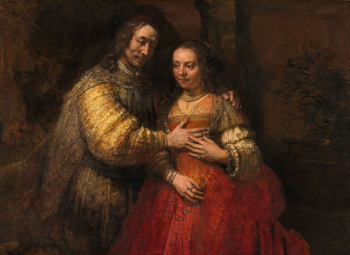
Rembrandt Harmensz. van Rijn, Portrait of a Couple as Isaac and Rebecca (known as The Jewish Bride), ca. 1665 — Source
If
Dutch painters wanted a golden yellow like orpiment without the risk of
poisoning, the Age of Empire supplied another option. From the
seventeenth century, Dutch paintings (including those of Jan Vermeer)
begin to feature a pigment known as Indian yellow, brought from the
subcontinent by the trading ships of Holland. It arrived in the form of
balls of dirty yellowish-green, although bright and untarnished in the
middle, which bore the acrid tang of urine. What could this stuff be?
Might it truly be made from urine in some way? Lurid speculation
abounded; some said the key ingredient was the urine of snakes or
camels, others that it was made from the urine of animals fed on
turmeric.
The
mystery seemed to be solved in the late nineteenth century by T. N.
Mukharji, an author, civil servant, and curator at Kolkata's Indian
Museum. Making enquiries in Kolkata, Mukharji was directed to a village
on the outskirts of the city of Monghyr in Bihar province, allegedly the
sole source of the yellow material. Here, he reported, he found that a
group of cattle owners would feed their livestock only on mango leaves.
They collected the cows’ urine and heated it to precipitate a yellow
solid which they pressed and dried into lumps.
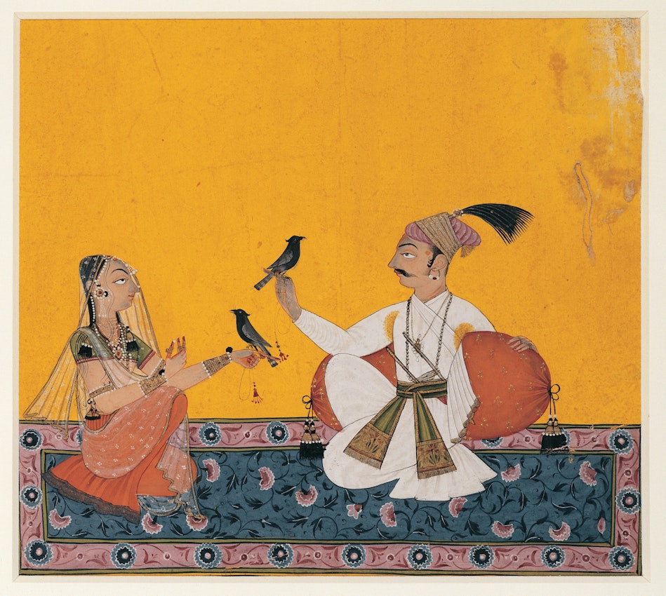
Ragamala Rajput painting from northern India, ca. 1700, displaying heavy use of "Indian yellow" — Source
_-_Teignmouth_-_T03882_-_Tate-edit.jpg?fit=max&w=1200&h=850)
J. M. W. Turner, Teignmouth,
1812. One of many Turner paintings to use "Indian yellow", but one of
only a few to feature the animal whose urine lies at the centre of the
colour's legend — Source
If
deadly arsenic-laden powers or cows’ urine did not appeal to artists,
the choice of yellows was decidedly lacklustre — literally. There were
yellow plant extracts, such as weld or saffron, that faded easily, or
compounds of tin, lead and antimony with a pale, insipid quality. It’s
not hard, then, to imagine the excitement of the French chemist Nicolas
Louis Vauquelin when at the start of the nineteenth century he found he
could make a vibrant yellow material by chemical alteration of a mineral
from Siberia called crocoite.
The
name was aptly chosen, because Vauquelin soon discovered that chromium
could produce compounds with various bright colours. Crocoite is a
natural form of lead chromate, and when Vauquelin reconstituted this
compound artificially in the laboratory, he found it could take on a
bright yellow form. Depending on exactly how he made it, this material
could range from a pale primrose yellow to a deeper hue, all the way
through to orange. Vauquelin figured by 1804 that these compounds could
be artists’ pigments, and they were being used that way even by the time
the French chemist published his scientific report on them five years
later.
The
pigment was expensive, and remained so even when deposits of crocoite
as a source of chromium were discovered also in France, Scotland, and
the United States. Chromium could also supply greens, most notably the
pigment that became known as viridian and which was used avidly by the
Impressionists and by Paul Cézanne.
The
chromium colours play a major role in the explosion of prismatic colour
during the nineteenth century — evident not just in Impressionism and
its progeny (Neo-Impressionism, Fauvism, and the work of Van Gogh) but
also in the paintings of J. M. W. Turner and the Pre-Raphaelites. After
the muted and sometimes downright murky shades of the eighteenth century
— think of Joshua Reynolds’ muddy portraits and the brownish foliage of
Poussin and Watteau — it was as if the sun had come out and a rainbow
arced across the sky. Sunlight itself, the post-Impressionist Georges
Seurat declared, held a golden orange-yellow within it.
_2012.89.8-edit.jpg?fit=max&w=1200&h=850)
Georges Seurat, Seascape (Gravelines), 1890 — Source
For
their sun-kissed yellows, the Pre-Raphaelites and Impressionists did
not need to rely on chromium alone. In 1817, the German chemist
Friedrich Stromeyer noticed that zinc smelting produced a by-product
with a yellow colour in which he discovered another new metallic
element, named after the archaic term for zinc ore, cadmia: he
called it cadmium. Two years later, while experimenting on the chemistry
of this element, he found that it would combine with sulfur to make a
particularly brilliant yellow — or, with some modification to the
process, orange. By the mid-century, as zinc smelting expanded and more
of the byproduct became available, these materials were offered for sale
to artists as cadmium yellow and cadmium orange.
Or
dyes. If you buy a tube labeled “Indian yellow” today, mangoes and cows
had nothing to do with it. It probably contains a synthetic pigment
that goes by the unromantic name of PY (pigment yellow) 139 — a
carbon-based molecule that is one of the countless offshoots of the
industry that arose in the nineteenth century to supply bright dyes for
textiles. The first of these artificial dyes, discovered in 1856, was
aniline mauve. A chemically related “aniline yellow” — a member of the
important family of colorants called azo dyes — was sold commercially
from 1863.
This
manufacture of a galaxy of synthetic colours from petrochemicals seems a
deeply unglamorous way to brighten the world today, compared to the age
of King’s yellow, saffron, and Indian yellow. It could feel that what
is saved in the purse is sacrificed in the romance. Maybe so. But
artists are typically pragmatic people, as eager for novelty as they are
attached to tradition. There has never been a time when they have not
avidly seized on new sources of colour as soon as those appear, nor when
they have not relied on chemistry to generate them. The collaboration
of art and science, craft and commerce, chance and design, remains as
vibrant as ever.
Blue
has always spoken to something beyond ourselves: it is a colour that
draws us into the void, the infinite sky. “Blue is the typical heavenly
colour”, said Wassily Kandinsky in his book Concerning the Spiritual in Art (1912).5
And who would doubt it after seeing the ceiling of the Arena Chapel in
Padua, painted by Giotto around 1305, a vault coloured like the last
moments of a clear Italian twilight? Some cultures don’t even recognise
the sky as having a hue at all, as if to acknowledge that no earthly
spectrum can contain it. In the ancient Greek theory of colour, blue was
a kind of darkness with just a little light added.
)](https://the-public-domain-review.imgix.net/essays/primary-sources/Virgin_Mary_-_Ceiling_-_Capella_degli_Scrovegni_-_Padua_2016-edit-2.jpg?fit=max&w=1200&h=850)
Detail
featuring the Virgin Mary, from the ceiling of the Capella degli
Scrovegni (Arena Chapel), in Padua, magnificently adorned with Giotto
frescoes in ca. 1305. For the luminous blue throughout Giotto made use
of ultramarine, which, due to its chemistry and expense, had to be
applied on top of the already-dry fresco (fresco secco) — Source (Photo: José Luiz Bernardes Ribeiro, CC BY-SA 4.0)
There’s
a strong case to be made, then, that shades of midnight have always
been the most treasured of artists’ colours. One of the earliest of the
complex blue pigments made by chemistry was virtually an ancient
industry in itself. The blue-glazed soapstone carvings known now as
faience produced in the Middle East were traded throughout Europe by the
second millennium BCE. Faience is typically now associated with ancient
Egypt, but it was produced in Mesopotamia as long ago as 4500 BC, well
before the time of the Pharaohs. It is a kind of glassy blue glaze, made
by heating crushed quartz or sand with copper minerals and a small
amount of lime or chalk and plant ash. The blue tint comes from copper —
it is of the same family as the rich blue copper sulfate crystals of
the school chemistry lab, although faience could range from
turquoise-green to a deep dusk-blue. These minerals were typically those
today called azurite and malachite, both of them forms of the compound
copper carbonate. It’s not at all unlikely, although probably impossible
to prove, that the manufacture of glass itself from sand and alkaline
ash or mineral soda began in experiments with firing faience in a kiln
somewhere in Mesopotamia.
Similar
experimentation might have given rise to the discovery of the trademark
blue pigment of the Egyptians, simply known as Egyptian blue or frit.
The recipe, at any rate, is almost the same: sand, copper ore, and chalk
or limestone. But unlike faience glaze, this material is not glassy but
crystalline, meaning that the atoms comprising it form orderly arrays
rather than a jumble. Producing the pigment requires some artisanal
skill: both the composition and the kiln temperature must be just so,
attesting to the fact that Egyptian chemists (as we’d call them today)
knew their craft — and that the production of colours was seen as an
important social task. After all, painting was far from frivolous:
mostly it had a religious significance, and the artists were priests.
The
minerals azurite and malachite make good pigments in their own right —
the first more bluish, the second with a green tint. They just need to
be ground and mixed with a liquid binder. In the Middle Ages that was
generally egg yolk for painting on wooden panels, and egg white (called
glair) for manuscript illumination. Good-quality azurite wasn’t cheap,
but there were deposits of the mineral throughout Europe. To the English
(who had no local sources) it was German blue; the Germans knew it as
mountain blue (Bergblau).
-edit.jpg?fit=max&w=1200&h=850)
Albrecht Altdorfer, Christ Taking Leave of His Mother, ca. 1520 — Source
A
cheaper blue was the plant extract indigo, used as a dye since ancient
times. Unlike most organic dyes — those extracted from plants and
animals — it doesn’t dissolve in water, but can be dried and ground into
a powder like a mineral pigment, and then mixed with standard binding
agents (such as oils) to make a paint. It gives a dark, sometimes
purplish blue, sometimes lightened with lead white; Cennino described a
“sort of sky blue resembling azurite” made this way from “Baghdad
indigo”.6 As the name suggests — the Latin indicum
shares the same root as “India” — the main sources for a European
medieval artist were in the East, although a form of indigo could also
be extracted from the woad plant, grown in Europe.
But
the artist who could find a patron with deep pockets would be inclined
towards a finer blue than any of these. When the Italian traveller Marco
Polo reached what is today Afghanistan around 1271, he visited a quarry
on the remote headwaters of the Oxus River. “Here there is a high
mountain”, he wrote, “out of which the best and finest blue is mined.”7 The region is now called Badakshan, and the blue stone is lapis lazuli, the source of the pigment ultramarine.
Cennino
shows us how deeply ultramarine blue was revered in the Middle Ages,
writing that it “is a colour illustrious, beautiful, and most perfect,
beyond all other colours; one could not say anything about it, or do
anything with it, that its quality would not still surpass”.8
As the name implies, it came from “beyond the seas” — imported, since
around the thirteenth century, at great expense from the Badakshan
mines.
Ultramarine
was precious not just because it was a rare import, but because it was
extremely laborious to make. Lapis lazuli is veined with the most
gorgeous deep blue, but grinding it is typically disappointing: it turns
greyish because of the impurities in the mineral. These impurities have
to be separated from the blue material, which is done by kneading the
powdered mineral with wax and washing the wax in water — the blue
pigment flushes out into the water. This has to be done again and again
to purify the pigment fully. The finest grades of ultramarine come out
first, and the final flushes give only a low-quality, cheaper product,
called ultramarine ash. The best ultramarine cost more than its weight
in gold in the Middle Ages, and so it was usually used sparingly. To
paint an entire ceiling with the colour, as Giotto did in the Arena
Chapel, was lavish in the extreme.
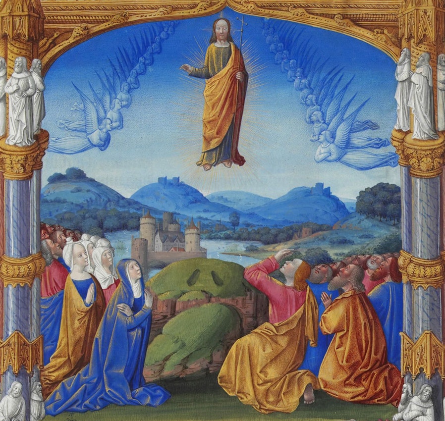
Detail from "The Ascension" (folio 184r) from the Très Riches Heures du duc de Berry, ca. 1412 — Source
More
often the medieval painter would use ultramarine only for the most
precious components of a painting. That seems to be the real reason why
most altarpieces of this period that depict the Virgin Mary show her
with blue robes. For all that art theorists have attempted to explain
the symbolic significance of the colour — the hue of humility or virtue,
say — it was largely a question of economics. Or, you might say, of
making precious materials a devotional offering to God.
You can compare azurite and ultramarine side by side in Titian’s explosion of Renaissance colour, Bacchus and Ariadne
(1523). Here is that starry vault, turning to day before our eyes, and
it is painted in ultramarine. So too is Ariadne’s robe, which dominates
the scene. But the sea itself, on which we see Theseus’s boat receding
from his abandoned lover, is azurite, with its greenish tint.
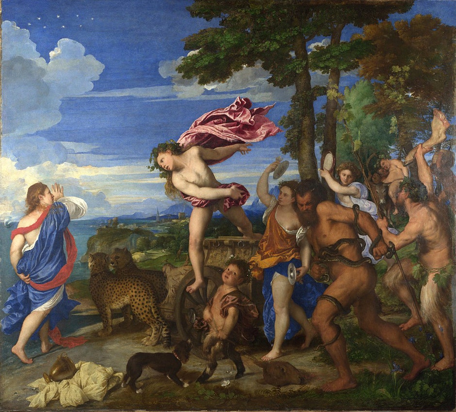
Titian, Bacchus and Ariadne, 1523 — Source
Over
the centuries, artists accumulated a few other blues too. Around 1704 a
colour-maker named Johann Jacob Diesbach, working in the Berlin
laboratory of alchemist Johann Conrad Dippel, was attempting to make a
red lake pigment when he found that he had produced something quite
different: a deep blue material. He had used a batch of the alkali
potash in his recipe, supplied by Dippel — but which was contaminated
with animal oil allegedly prepared from blood. The iron used by Diesbach
reacted with the material in the oil to make a compound that —
unusually for iron — is blue in colour. By 1710 it was being made as an
artist’s material, generally known as Prussian blue.
It
wasn’t entirely clear what had gone into this mixture, and so for some
years the recipe for making Prussian blue was surrounded by confusion
and secrecy. In 1762 one French chemist declared that “Nothing is
perhaps more peculiar than the process by which one obtains Prussian
blue, and it must be owned that, if chance had not taken a hand, a
profound theory would be necessary to invent it.”9
But chance was a constant companion in the history of making colours.
At any rate, Prussian blue was both attractive and cheap — a tenth of
the cost of ultramarine — and it was popular with artists including
Thomas Gainsborough and Antoine Watteau. It comprises some of the rich
blue Venetian skies of Canaletto.
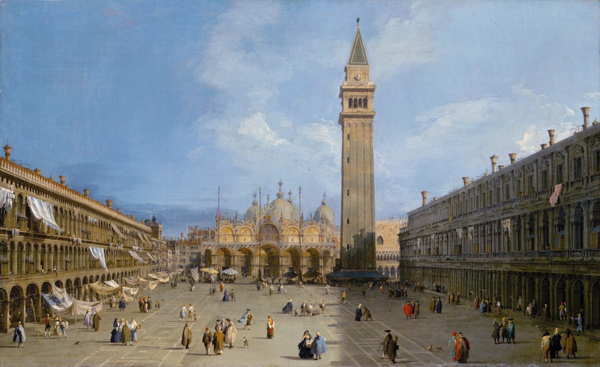
Canaletto, Piazza San Marco, ca. 1725 — Source
Another
blue from the Renaissance and Baroque periods went by the name of
smalt, which is not so very different from the cobalt-blue glass of
Gothic cathedrals such as Chartres, ground to a powder. Its origins are
obscure, but may well come out of glass-making technology; one source
attributes the invention to a Bohemian glassmaker of the mid-sixteenth
century, although in fact smalt appears in earlier paintings. Cobalt
minerals were found in silver mines, where their alleged toxicity
(actually cobalt is only poisonous in high doses, and trace amounts are
essential for human health) saw them named after “kobolds”, goblin-like
creatures said to haunt these subterranean realms and torment miners.
Natural cobalt ores such as smaltite were used since antiquity to give
glass a rich blue colour, and smalt was produced simply by grinding it
up — not too finely, because then the blue becomes too pale as more
light is scattered by the particles. As a result of its coarse grains,
smalt was a gritty material and not easy to use.
Some
art historians make no distinctions between this “cobalt blue” and
those that were given the name in the nineteenth century. But the latter
were much finer, richer pigments, made artificially by systematic
chemistry. In the late eighteenth century the French government asked
the renowned chemist Louis-Jacques Thénard to look for a synthetic
substitute for expensive ultramarine. After consulting potters, who used
a cobalt-tinted glassy blue glaze, in 1802 Thénard devised a strongly
coloured pigment with a similar chemical constitution: technically, the
compound cobalt aluminate. Cobalt yielded several other colours besides
deep blue. In the 1850s a cobalt-based yellow pigment called aureolin
became available in France, followed soon after by a purple pigment
called cobalt violet: the first ever pure purple pigment apart from a
few rather unstable plant extracts. A sky blue pigment called cerulean
blue, a compound of cobalt and tin, was a favourite of some of the
post-Impressionists.
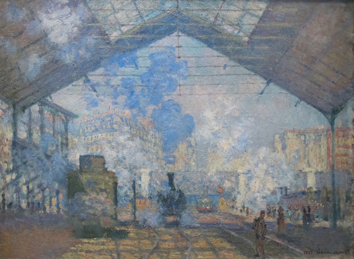
Claude Monet, La Gare Saint-Lazare, 1877 — Source
But
what artists craved most of all was ultramarine itself — if only it
wasn’t so expensive. Even by the mid-nineteenth century it remained
costly, which is why the Pre-Raphaelite Dante Gabriel Rossetti
caused much dismay (not to mention added expense) when he upset a big
pot of ultramarine paint while working on a mural for Oxford University.
By
Rossetti’s time, however, artists did at last have an alternative —
it’s just that several of them had not yet learnt to trust it. As
chemical knowledge and prowess burgeoned in the early nineteenth
century, bringing new pigments such as cobalt blue onto the market, it
seemed within the realms of possibility to try to make ultramarine
artificially.
It
was a prize well worth striving for, because pigment manufacture had
become big business. The manufacture of colours and paints wasn’t
supplying artists; there was now a taste for colour in the world at
large, in particular for interior decoration. Factories were set up in
the nineteenth century to make and grind pigments. Some sold them in
pure form to the artist’s suppliers, who would then mix up paints for
their customers from pigment and oil. But some pigment manufacturers,
such as Reeves and Winsor & Newton in England, began to provide oil
paints ready-made; from the 1840s these were sold in collapsible tin
tubes, which could be sealed to prevent paints from drying out and could
be conveniently carried for painting out of doors.
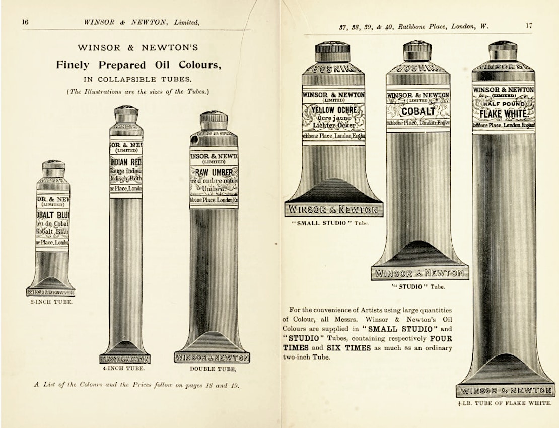
Pages from a Winsor & Newton catalogue, ca. 1895 — Source
Mindful
of the importance of the pigment market, in 1824 the French Society for
Encouragement of National Industry offered a prize for the first
practical synthesis of ultramarine. It is a complicated compound to make
— unusually for such inorganic pigments, the blue colour comes not from
a metal but from the presence of the element sulphur in the mineral
crystals. This composition of ultramarine was first deduced by two
French chemists in 1806, offering clues about what needed to go into a
recipe for making it. In 1828, an industrial chemist named Jean-Baptiste
Guimet in Toulouse described a way to make the blue material from clay,
soda, charcoal, sand and sulfur, and he was awarded the prize (despite a
rival claim from Germany). In England this synthetic ultramarine was
subsequently widely known as French ultramarine, and Guimet was able to
sell it at a tenth of the cost of the natural pigment. By the 1830s
there were factories making synthetic ultramarine throughout Europe.
Artists
looked upon this substitute with considerable caution, however.
Ultramarine still retained some of its old mystique and majesty, and
painters were reluctant to believe that it could be turned out on an
industrial scale. Perhaps the synthetic variety was inferior — might it
fade or discolour? Actually synthetic ultramarine is (unlike some
synthetic pigments) very stable and reliable, but J. M. W. Turner was
evidently still wary of it when, in the mid-century, he was about to
help himself to the ultramarine on another artist’s palette during one
of the “finishing days” at the Royal Academy, where artists put their
final touches to paintings already hung for display on the walls.
Hearing the cry that this ultramarine was “French”, Turner declined to
dab into it.
But
by the end of the century, synthetic ultramarine was a standard
ingredient of the palette: small wonder, given that it could be a
hundred or even a thousand times cheaper than the natural variety.
Synthetic ultramarine is the pigment in Yves Klein’s patented
International Klein Blue, which he used for a series of monochrome
paintings in the 1950s and early 60s. But ultramarine never looked like
this before — at least, not on the canvas.
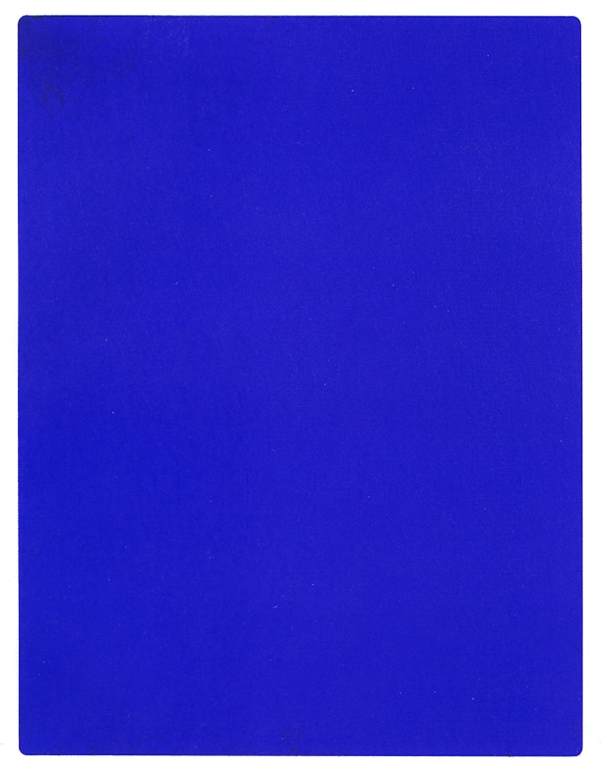
Yves Klein, IKB 191, 1962, one of a number of works Klein painted with International Klein Blue — Source (Not public domain)
Klein
noticed that pigments tend to look richer and more gorgeous as a dry
powder than when mixed with a binder — another consequence of how light
gets transmitted and refracted — and he sought to capture this
appearance in a paint. In 1955 he found his answer in a synthetic
fixative resin called Rhodopas M60A, made by the Rhone-Poulenc chemicals
company, which could be thinned to act as a binder without impairing
the chromatic strength of the pigment. This gave the paint surface a
matt, velvety texture. Klein collaborated with Edouard Adam, a Parisian
chemical manufacturer and retailer of artists’ materials, to develop a
recipe for binding ultramarine in this resin, mixed with other solvents.


Further Reading
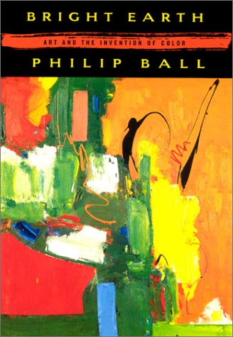
- A fascinating historical study into how art and technology have interacted through the ages to bring us art in colour.
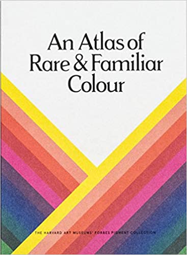
- Visually excavating Harvard Art Museums’ extraordinary collection, this book examines the contained pigments and artefacts ― their provenance, composition, symbology and application. It also explores the larger related fields of chromatics, the historical narratives of art and chemistry, and the innovations with which we have sought to better illustrate our aesthetic and expressive compulsions.
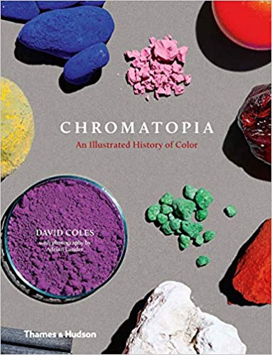
- This origin story of history’s most vivid color pigments is perfect for artists, history buffs, science lovers, and design fanatics. Spanning from the ancient world to modern leaps in technology, and vibrantly illustrated throughout, this book will add a little chroma to anyone’s understanding of the history of colors.
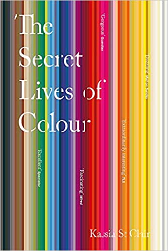
- The unusual stories of the 75 most fascinating shades, dyes and hues. From blonde to ginger, the brown that changed the way battles were fought to the white that protected against the plague, Picasso's blue period to the charcoal on the cave walls at Lascaux.
Books
link through to Amazon who will give us a small percentage of sale
price (ca. 4.5%). Discover more recommended books in our dedicated PDR Recommends section of the site.
Philip Ball is a freelance science writer and broadcaster. He worked previously at Nature
for over 20 years, first as an editor for physical sciences and then as
a Consultant Editor. His writings on science for the popular press have
covered topical issues ranging from cosmology to the future of
molecular biology. His books include Bright Earth: The Invention of Colour (Penguin, 2002), Invisible: The Dangerous Allure of the Unseen (University Of Chicago Press, 2015) and most recently, How To Grow a Human (William Collins, 2019).
Categories
Tags
Related Essays
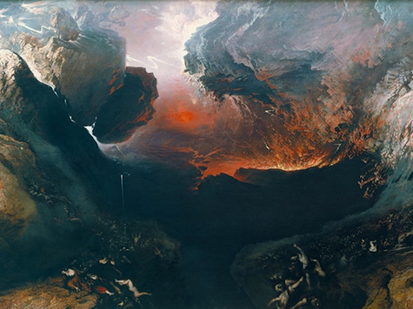
Max Adams, author of The Prometheans,
looks at the art of John Martin and how in his epic landscapes of
apocalyptic scale one can see reflected his revolutionary leanings.
more
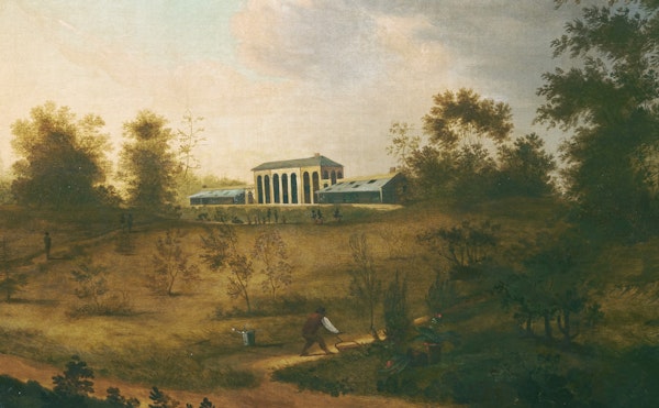
Rebecca
Rego Barry on David Hosack, the doctor who attended Alexander Hamilton
to his duel (and death), and creator of one of the first botanical
gardens in the United States, home to thousands of species which he used
for his pioneering medical research.
more
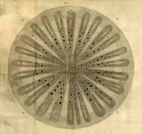
In the 82 illustrated plates included in his 1680 book The Anatomy of Plants,
the English botanist Nehemiah Grew revealed for the first time the
inner structure and function of plants in all their splendorous
intricacy. Brian Garret explores how Grew's pioneering "mechanist"
vision in relation to the floral world paved the way for the science of
plant anatomy.
more
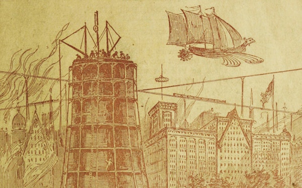
The
destruction of Atlantis, cataclysmic comets, and a Manhattan tower made
entirely from concrete and corpse — Carl Abbott on the life and work of
a Minnesotan writer, and failed politician, with a mind primed for
catastrophe.
more
Chocolate
has not always been the common confectionary we experience today. When
it first arrived from the Americas into Europe in the 17th century it
was a rare and mysterious substance, thought more of as a drug than as a
food. Christine Jones traces the history and literature of its
reception.
more
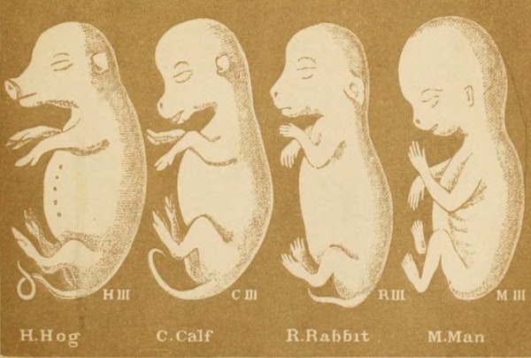
Copying
— unoriginal, dull, and derivative by definition — can be creative,
contested, and consequential in its effects. Nick Hopwood tracks
Haeckel’s embryos, some of the most controversial pictures in the
history of science, and explores how copying put them among the most
widely seen.
more
Mary
Fissell on how a wildly popular sex manual — first published in
17th-century London and reprinted in hundreds of subsequent editions —
both taught and titillated through the early modern period and beyond.
more
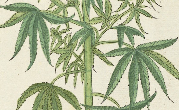
Cataleptic
trances, enormous appetites, and giggling fits aside, W. B.
O'Shaughnessy's investigations at a Calcutta hospital into the potential
of medical marijuana — the first such trials in modern medicine — were
largely positive. Sujaan Mukherjee explores the intricacies of this
pioneering research and what it can tell us more generally about the
production of knowledge in colonial science.
more
