Impressions of Colors
On William Blake’s monoprints.
William Blake (1757–1827) is probably best known today for “The Tyger,” one of the most anthologized poems in the English language, from Songs of Innocence and of Experience (1794), one of the most celebrated collections of poems from the Romantic period. Many readers of Blake also know that Songs was one of twelve “illuminated books” that Blake wrote, illustrated, and printed between 1788 and 1795 in relief etching, a technique he invented. In addition to being a visionary poet, an exceedingly creative printmaker, and an inventor, Blake was a masterful engraver, prolific illustrator, innovative designer, and an artist of astonishing originality.
Among the most widely recognized and highly regarded works by him as an artist are his twelve color-printed drawings, or monoprints, conceived and first executed—in another medium of his own invention—in 1795. The first to point out the excellence and importance of these works was William Michael Rossetti, in his catalogue raisonné of Blake’s works, which forms part of the second volume of Alexander Gilchrist’s Life of William Blake (1863). He states: “The color-printed designs are the most complete, solid, and powerful works in color left by Blake.” W. Graham Robertson (1866–1948), a poet, painter, and collector who once owned ten of the designs, agreed, noting that “these curious works, half printed, half painted, represent Blake’s highest achievement in technique, so are they also among the mightiest of his designs.” Blake’s monoprinting process and its relation to relief etching and illuminated books are also poorly understood, its technical and historical contexts remain mostly unexamined, and the sequence and dates of designs, printings, and impressions are mostly mistaken.
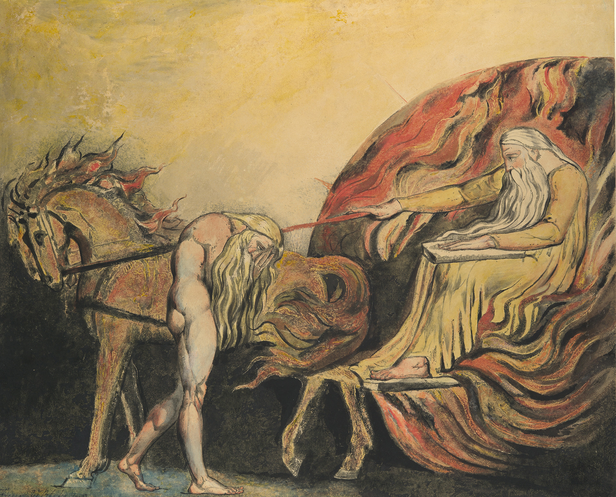
The designs were Blake’s largest works at the time. They are in landscape format, measuring between around forty-two by fifty-two and forty-six by sixty-two centimeters. Blake began by drawing a design on a matrix (first metal plates, then millboards) and painting it in with opaque water-miscible colors; he printed the colors before they dried onto large sheets of damp paper, which, after the colors dried, he finished in watercolors, black paint, and pen-and-ink outlining.
Blake invented this medium in 1795 and stopped using it for new designs the same year. The medium was not used over a period of years, as some critics believe, nor was it a “favorite system,” as Blake’s friend Frederick Tatham (1805–1878) told W.M. Rossetti in a brief but important account of Blake’s monoprinting technique. Rather, Blake used it intensely in 1795, executing nine designs that re-created earlier images of his and three designs made specifically for the new medium. He systematically printed two impressions from each design on its completion and three impressions from three designs, for a total of twenty-seven impressions in 1795. Blake reprinted three designs around 1795–96 and two others in 1805 for six more impressions. Only twenty-nine of the thirty-three impressions printed are extant.
The monoprints defy easy categorization because they are part drawing, part painting, and part print, simultaneously painted and printed objects based on outline drawings on matrices. Thomas Butts (1757–1845), Blake’s first patron, owned eleven impressions and knew them as “prints,” Blake’s term for them in their 1806 receipts account. In an 1818 letter to the collector Dawson Turner (1775–1858), Blake referred to them as “Large Prints…Printed in Colors.” These are the only extant documents in which Blake mentions the monoprints. Around 1809, however, he signed five of them “Fresco W Blake inv,” apparently having reconceived them as paintings.
Today, the monoprints are referred to as “color-printed drawings” and “large color prints,” which describe them only in part. They are designs printed in colors on paper, the conventional support of drawings and watercolors, but because the colors are opaque and have body, impressions look and feel like paintings. A more accurate description would be “color-printed painting,” a painting made by applying colors to paper (in place of canvas or panel) indirectly and directly, by printing and finishing, using printed colors as the painting’s underdrawing.
They are also referred to as monotypes, a term often used interchangeably with monoprint. In both techniques, images are made on matrices that are printed onto paper. Unlike conventional prints, no two impressions of the same design can look exactly the same because painting matrices and finishing impressions involved a high degree of improvisation, hence the oxymoronic monoprint and monotype—prints that are not exactly repeatable.
Monotypes, however, are purely improvisational images because they are printed from matrices without fixed forms or lines. One can print—or “pull”—second and even third impressions (known as “cognates” or “ghosts”) from an inked or painted monotype matrix, but one cannot reprint the design once the matrix is cleaned of ink or colors. Once cleaned, the design ceases to exist. For Blake to have produced impressions years after creating their matrices means that the designs’ outlines were necessarily fixed on the matrices and that Blake could repaint and reprint them whenever he wanted.
. Middle: The Metropolitan Museum of Art, Gift of Mrs. Robert W. Goelet, 1958, transferred from European Paintings. Bottom: Yale Center for British Art, Paul Mellon Collection.")
Blake’s method for printing colors to produce paintings was radical and new. Contemporary printmaking and painting treatises do not mention it; no words for the process or its product existed other than, perhaps, “Large Prints…in Colors.” Whatever we call them, and whatever else they might be, they are, in fact, printed paintings. They are unique painted objects produced in part by a technique designed to make multiples. The scholar Robert N. Essick in 1989 made a similar claim for Blake’s relief etchings, recognizing them as “printed manuscripts.” This perceptive oxymoron captures the essence of Blake’s unique multiples: they appear autographic and intimate because Blake executed texts and illustrations with pens, brushes, and an acid-resistant ink on copper plates and etched them in acid into printable relief. In other words, he engaged in the acts of writing and drawing with the tools defining these acts. Thus, his printed texts and outlines look like manuscripts and drawings because of how he produced them, not because he imitated the codes of writing and drawing or reproduced pre-existent designs in “fac-simile,” as Gilchrist (and others) supposed. What Blake’s relief etchings are to manuscripts and drawings, Blake’s monoprints are to paintings. Blake used brushes and opaque colors to draw and paint in outlines and to add colors and washes to impressions, performing as a painter from start to finish. He painted most designs on millboards that were prepared as though they were canvases for oil paintings, that is, with gesso grounds. The colors were transferred to paper using a rolling press with light pressure.
The monoprints evolved from techniques Blake developed in 1794 and 1795 to print-relief etchings and etchings in colors. He was almost certainly unaware of the monoprints and monotypes of Hercules Segers (1589–1638), Antoon Sallaert (1594–1650), and Giovanni Benedetto Castiglione (1609–1664). These painters were also experimental and innovative printmakers who appear to have invented monoprints and monotypes independent of one another at around the same time. Segers printed etchings in colors and on colored grounds to produce monoprints. Segers and Sallaert drew designs in oil-based colors and inks on unetched plates and printed them to produce monotypes. Castiglione used this technique, now termed “additive” or “light field,” and also cut through thin layers of ink to produce white lines, a technique now termed “subtractive” or “dark field.”

Monotypes were not produced again until late in the nineteenth century, when Edgar Degas (1834–1917) composed freely and directly in both the additive and subtractive manners, often adding oil or chalk pastels over printed images. Blake was not as prolific as Degas, but he developed monoprinting further than his predecessors, painting in a wider range of full-bodied colors on larger matrices and producing prints that were more painting than drawing. Blake’s experiments in printing colors anticipate today’s monoprints and monotypes, which are mostly created in oil colors or diluted printer’s inks on lightweight metals or plastics and printed on damp paper.
The most radical descendants of Blake’s monoprinting experiments are the “decalcomania” paintings of the early 1940s by the Surrealist painter Max Ernst (1891–1976). In decalcomania, a flat matrix is covered in thick oil colors and a prepared canvas or sheet of paper is laid on top of it and rubbed from the verso to transfer colors. What Tatham said of Blake’s monoprints—that they “gave the sort of impression you will get by taking the impression of anything wet”—is also true of Ernst’s decalcomania paintings. Tatham also observed that “there was a look of accident about this mode which [Blake] afterwards availed of, and tinted so as to bring out and favor what was there rather blurred.” In paintings incorporating decalcomania, for example Napoleon in the Wilderness, Ernst used fine brushes and pens “to bring out and favor” forms in the blurred and blotted colors. Such worked-up and “smeared forms” call “to mind mineral life and hybrid creatures”—not unlike the sea anemones and polyps that Blake brought out of the spongy cauldron of transferred paint forming the seabed in his Newton.
Ernst sought to create images that were “beyond painting,” beyond traditional—and rational—modes of perception. He recognized a link between his attempts to elicit images from his unconscious mind and Leonardo da Vinci’s famous comment about accidental shapes stimulating the imagination. In Beyond Painting (1948), Ernst quoted the key passage in Leonardo’s text: “If you look upon an old wall covered with dirt, or the odd appearance of some streaked stones, you may discover several things like landscapes, battles, clouds, uncommon attitudes, humorous faces, draperies &c. Out of this confused mass of objects, the mind will be furnished with abundance of designs and subjects perfectly new.”
.")
Ernst’s purposeful creation of accidental forms for mental stimulation was not unprecedented. Blake’s contemporary, Alexander Cozens (1717–1786), did the same and cites the same passage to explain the efficacy of his “new method” for teaching students how to invent original landscapes. Cozens created a visual field of indiscriminate white and black shapes using inkblots. He stated: “To sketch…is to transfer ideas from the mind to the paper, or canvas, in outlines, in the slightest manner. To blot, is to make…accidental forms without lines, from which ideas are presented to the mind.” Among the blots the artist finds and extracts an outline of a landscape and transfers it to a clean sheet of paper to work up as a wash drawing.
Cozens was much ridiculed by neoclassically trained artists, who, like Blake, used the terms blots and blurs pejoratively, to refer to the formlessness of images or absence of firm and distinct outlining. Nevertheless, according to Tatham, Blake’s colors as initially printed on paper had “a look of accident,” as though “blotted on,” requiring that the image be finished “so as to bring out” ideas and forms that were otherwise vague and “blurred.” The unfinished printed designs were indistinct, splotchy, and, necessarily, blurry with soft edges. The head of a bat-like creature in Hecate exemplifies Blake’s need to clarify and define such printed forms—and his comfort with improvisation. Blake drew the head in simple outline on a matrix and blocked it out in colors. As printed, the head would have been a vague image, comprising indistinct blots and blurs, which required Blake to find and define the form in pen-and-ink outline. The head emerging through each stage of its production embodies Blake’s maxim that “Execution Is the Chariot of Genius.”
While Blake did not take the idea of execution generating invention nearly as far as Ernst and Cozens, his receptivity to execution’s role in invention clearly informs his theory and practice of art. This receptivity was in full display in monoprinting, which requires a keen sensitivity to the materiality of painting. The medium was not taken up by other artists until the late nineteenth and early twentieth centuries, and then mostly by painters. It is not a good medium for printmakers, who need proofs or firm control over the final image, or for painters who work slowly or want aerial perspectives, modeling, or substantial detail. It is too unconventional for all but the most adventurous of artists, the ones who understand gestural expressions, enjoy experimentation, and welcome accident and improvisation. With the medium so poorly documented, Degas, Pissarro, Gauguin, Picasso, Chagall, Maurice Prendergast, Rouault, Ernst, and many other artists had to rediscover the medium for themselves, a medium that Blake had reinvented, pioneered, and mastered.
Excerpted from William Blake’s Printed Paintings: Methods, Origins, Meanings by Joseph Viscomi, published by the Paul Mellon Centre. Copyright © 2021 Joseph Viscomi. Reprinted by permission of the Paul Mellon Centre.
ROUNDTABLE TUESDAY, JULY 20, 2021