Simpson’s Paradox and Interpreting Data
The challenge of finding the right view through data
Edward Hugh Simpson, a statistician and former cryptanalyst at Bletchley Park, described the statistical phenomenon that takes his name in a technical paper in 1951. Simpson’s paradox highlights one of my favourite things about data: the need for good intuition regarding the real world and how most data is a finite dimensional representation of a much larger, much more complex domain. The art of data science is seeing beyond the data — using and developing methods and tools to get an idea of what that hidden reality looks like. Simpson’s paradox showcases the importance of skepticism and interpreting data with respect to the real world, and also the dangers of oversimplifying a more complex truth by trying to see the whole story from a single data-viewpoint.
The paradox is relatively simple to state, and is often a cause of confusion and misinformation for non-statistically trained audiences:
Simpson’s Paradox:
A trend or result that is present when data is put into groups that reverses or disappears when the data is combined.


One of the most famous examples of Simpson’s paradox is UC Berkley’s suspected gender-bias. At the beginning of the academic year in 1973, UC Berkeley’s graduate school had admitted roughly 44% of their male applicants and 35% of their female applicants. The story usually goes that the school was sued for gender discrimination, although this isn’t actually true. The school did however fear a lawsuit, and so they had statistician Peter Bickel look at the data. What he found was surprising: there was a statistically significant gender bias in favour of women for 4 out of the 6 departments, and no significant gender bias in the remaining 2. Bickel’s team discovered that women tended to apply to departments that admitted a smaller percentage of applicants overall, and that this hidden variable affected the marginal values for the percentage of accepted applicants in such a way as to reverse the trend that existed in the data as a whole. Essentially, the conclusion flipped when Bickel’s team changed their data-viewpoint to account for the school being divided into departments!


Simpson’s paradox can make decision-making hard. We can scrutinise and regroup and resample our data as much as we are able to, but if multiple different conclusions can be drawn from all the different categorisations, then choosing a grouping to draw our conclusions from in order to gain insight and develop strategies is a nuanced and difficult problem. We need to know what we are looking for, and to choose the best data-viewpoint giving a fair representation of the truth. Let’s think about a simple example in business.
Strawberry vs Peach
Suppose we’re in the soft drinks industry and we’re trying to choose between two new flavours we’ve produced. We could sample public opinion on the two flavours — let’s say we choose to do so by setting up two sampling stalls for each flavour in a busy area and asking 1000 people at each stall if they enjoy the new flavour.


We can see that 80% of people enjoyed ‘Sinful Strawberry’ whereas only 75% of people enjoyed ‘Passionate Peach’. So ‘Sinful Strawberry’ is more likely to be the preferred flavour.
Now, suppose our marketing team collected some other information while conducting the survey, such as the sex of the person sampling the drink. What happens if we split our data up by sex?


This suggests that 84.4% of men and 40% of women liked ‘Sinful Strawberry’ whereas 85.7% of men and 50% of women liked ‘Passionate Peach’. If we stop to think, this might seem a little strange: according to our sample data, generally people prefer ‘Sinful Strawberry’, but both men and women separately prefer ‘Passionate Peach’. This is an example of Simpson’s Paradox!
Our intuition tells us that the flavour that is preferred both when a person is male or female should also be preferred when their sex is unknown, and it is pretty strange to find out that this is not true — this is the heart of the paradox.


Lurking variables
Simpson’s paradox arises when there are hidden variables that split data into multiple separate distributions. Such a hidden variable is aptly referred to as a lurking variable, and they can often be difficult to identify. Luckily, this is not the case in our soft drink example, and our marketing team should quickly be able to see that the sex of the person sampling the new flavours is affecting their opinion.
One way the paradox can be explained is by considering the lurking variable (sex) and a little bit of probability theory:
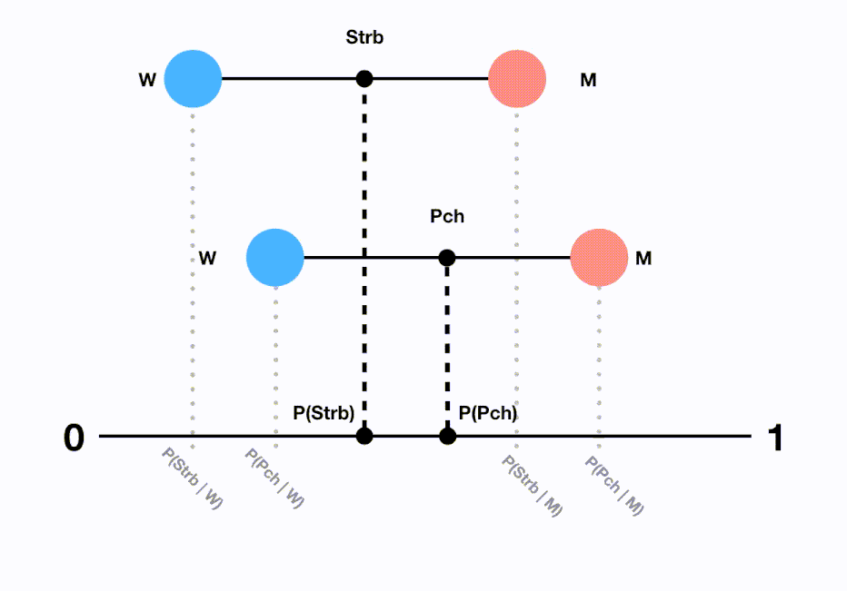
P(Liked Strawberry) = P(Liked Strawberry | Man)P(Man) + P(Liked Strawberry | Woman)P(Woman)
800/1000 = (760/900)×(900/1000) + (40/100)×(100/1000)
P(Liked Peach) = P(Liked Peach | Man)P(Man) + P(Liked Peach | Woman)P(Woman)
750/1000 = (600/700)×(700/1000) + (150/300)×(300/1000)


We can think of the marginal probabilities of sex (P(Man) and P(Woman)) as weights that, in the case of ‘Sinful Strawberry’, cause the total probability to be significantly shifted towards the male opinion. While there is still a hidden male bias in our ‘Passionate Peach’ sample, it is not quite as strong and thus a greater proportion of the female opinion is being taken into account. This results in a lower marginal probability for the general population to prefer this flavour despite each sex being more likely to prefer it when separated within the sample.
A visualisation of what’s going on:

In this example, our findings are pretty inconclusive, as there are tradeoffs to choosing either data-viewpoint depending on what our marketing team wants to achieve. Considering the groupings and realising that our findings are inconclusive is more useful to our business than coming up with an unsteady conclusion, and reporting this is the correct thing to do so that we can go back to the drawing board and resample and plan a more in-depth study that will generate real insight.
Which data do we consult?
In some experiments, the weighting of our sample could be due to some error in our sampling method. Indeed, the soft drink example we constructed above was inherently flawed in terms of generating a random sample. It is definitely important to know whether or not we’re looking at poorly sampled data, or a real case of the paradox. However, what if we realistically tried our best to generate an independent and unbiased sample and still ended up in a similar situation? From the perspective of a business with a product: it may simply be that regardless of our sampling method our product will be more attractive to certain demographics and this will be reflected in our data and may manifest as a lurking variable. This was the case with the departments that were more likely to be chosen by women in the aforementioned UC Berkley study.

With intuition, it is possible to uncover lurking variables through exploratory data analysis. We must then decide whether to break the data into separate distributions, or to keep the data combined. The correct decision is entirely situational and this is part of the reason why data science exists at the intersection of mathematics/statistics, computer science and business/domain knowledge: We need to know our data, and more importantly, what we want out of our data, in order to choose which approach to take. In our soft drinks business example, we decided to report that our findings were inconclusive despite customers initially seeming to prefer the ‘Sinful Strawberry’ flavour. In the UC Berkeley study, it makes logical sense to split up and interpret the data by department as there is no extra-departmental competition for admission. If we wanted to know about a hospital’s survival rate; we should probably split up our data to look at categorised groups of people who arrive at the hospital with different illnesses. This would help us make an informed decision about which hospital would be best for a given sick person, which is what we probably care about most. In every situation, the key is to interpret the data in relation to the underlying domain, and to take the most appropriate data-viewpoint.


That’s a wrap — thanks for reading!
If you enjoyed this post on Simpson’s paradox and interpreting data through data-viewpoints, feel free to get in touch with me (Tom Grigg) regarding any thoughts or queries!